
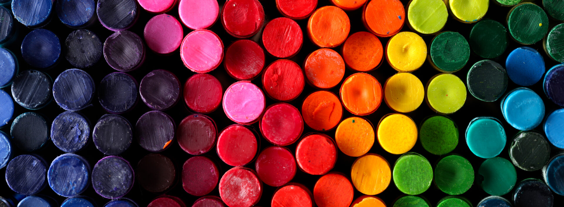
Color! In graphic design, few topics lead to more conversations than selecting the perfect colors for a project.
The color of a design element is core to its being. Few other characteristics of a design element lend more to its emotional and connotative load, provide a more effective shortcut to understanding for viewers, or cause more confusion for graphic design clients.
How designers talk about color can be complex and will vary depending on which project they’re working on, its audience, how it will be printed or displayed, and dozens of other variables.
In this article, we’ll break down some terms surrounding color and how they help designers and others communicate effectively about the colors that go into a particular design.
What Is Color?
From a scientific perspective, all colors are simply different frequencies of light. In your eye, special cells in your retina are attuned to three broad ranges of light “colors” – red, green, and blue. By combining the different colors, your eye sends an image full of colors to your brain.
In another sense, color is so much more than just reflected light. We rely on colors to keep us safe (red means stop!), to navigate (turn left at the blue house), to make cultural or social statements (the bride wore white), and to understand intricate technical systems (no, cut the green wire!).
We even use “color” as a shorthand for variety and interest, like when we talk about “adding a little color to a story” or when we tune into the football game to hear the color commentary. So, it’s no surprise that we’ve developed an entire language devoted to describing the colors that make up the world around us.
Color Spaces
There are countless ways to describe a color so that it can be reproduced accurately. Each one of these methods, called a color space, differs in the way it describes colors, and different types of projects require colors to be defined in different color spaces. The three color spaces most often used in graphic design are RGB, CMYK, and Pantone.
RGB
In the RGB color space, a color is defined by the relative amount of red, green, and blue light combined to create the color (white would be 100% of all three colors; black would be 0% of all three).
RGB is used to define colors when a project is going to be displayed on a screen and will usually be seen in web designs, digital ads, social media posts, and other digital formats.
(Sometimes, RGB colors are described as “hex” colors, from the term “hexadecimal.” For page elements on websites and other digital platforms, six-character codes can be used to provide an easy RGB color reference.)
CMYK
CMYK, sometimes called “process color,” is defined by the relative amounts of four different inks used in print to make up a color: Cyan, Magenta, Yellow, and Black. By overlaying tiny patterns of dots made up of these four colors, a process printing press can reproduce almost any color imaginable.
CMYK is used to define colors on print projects, like flyers, brochures, booklets, and signage, when the project contains photographs or other elements that require subtle color differences or a broad range of colors. Most desktop color printers also operate on the CMYK principle.
Pantone
Pantone is a licensed system of various inks and ink blends that can reproduce a perfect match on any licensed print equipment.
Pantone is typically used for projects relying on “spot color” or very distinct elements of a solid or subtly shaded single color. A business card, for instance, might be printed using only black and the 2-3 colors of a company’s logo. By selecting specific Pantone ink colors, a designer can ensure that any print shop worldwide can reproduce an exact match for the specified color.
Other Color Terms
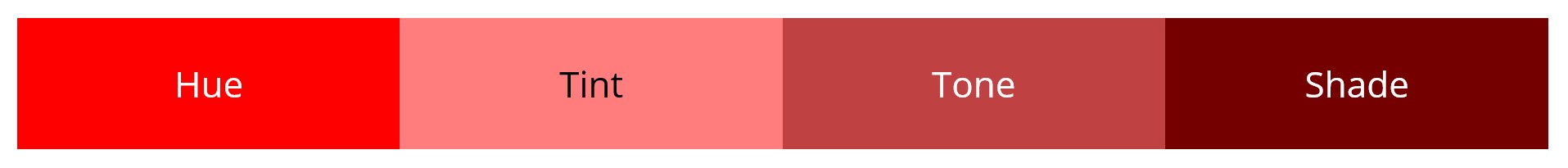
Hue/Tint/Tone/Shade
These four terms can be used by themselves to describe a specific color or, taken together, can compose an entirely new color space. When referring to hues, tints, tones, and shades, you’re using specific terms that define a particular base “pure” color, and then varying amounts of white, grey, or black are added to create lighter, darker, or more desaturated colors.
- Hue: The pure color on which a particular color is based. For instance, the pure bright red on a color wheel is a pure red hue.
- Tint: A pure color lightened by adding white to (or increasing the light intensity of) the color.
- Tone: A pure color desaturated (see below) by adding pure grey to (or reducing the color intensity of) the color.
- Shade: A pure color darkened by adding black to (or decreasing the light intensity of) the color.
Contrast
You’re familiar with contrast as a general term meaning “differences between two things” and in contexts like televisions, where a high “contrast ratio” means a more colorful picture. To a designer, contrast is a scale, referring to how different one color is from another. When used together in a design, two colors can be high- or low-contrast, depending on their hue, tint, shade, or tone.
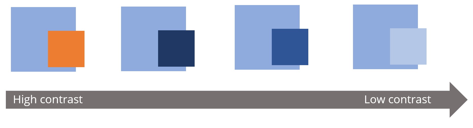
Contrast is a vital component of good design. It adds variety, pulls the eye into a design, and provides a way to call attention to important design or content elements.
In addition, contrast is a vital component of ensuring that a website is accessible to all users. Using colors without adequate contrast for content (for example, using very pale grey text on a white background) can render that content unreadable for someone with a visual impairment. Designing an accessible website requires the designer to verify that the content and background carry enough contrast to be legible for affected users.
Saturated/Desaturated
Most people understand “light” and “dark” as they pertain to color, but fewer understand color saturation. Saturation refers to the intensity of a specific color. Or, to look at it differently, desaturation refers to how dull or “washed out” a particular color looks. Consider this blue color at different levels of saturation:

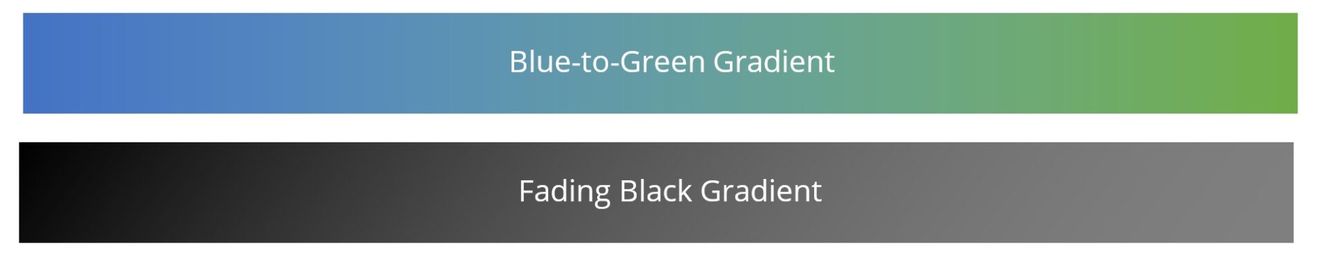
Gradient
This term means exactly what it sounds like: a gradual shading from one color to another. This can mean anything from a pure white fading into a rich black, a royal blue giving way to grass green, or any other color combination you can imagine.
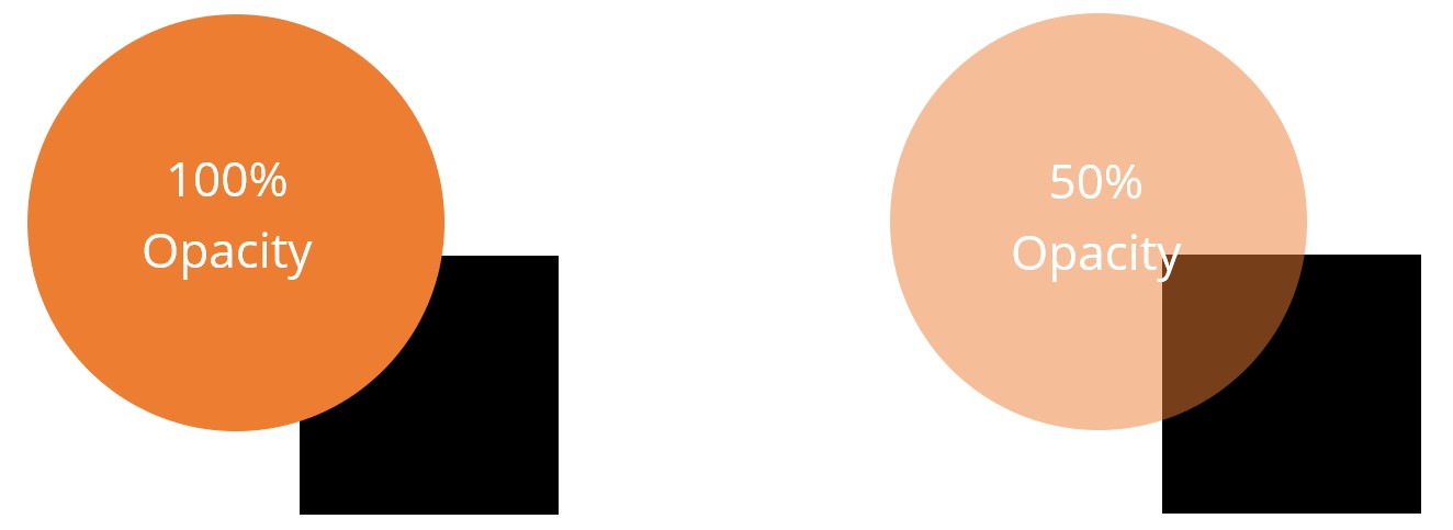
Opacity
The ability to see “through” something to a design element “behind” another. For instance, a low-opacity orange circle partially overlaying a black square would yield a darker orange in the location where the two shapes intersect due to the ability to see “through” the orange circle:
Whether You Know Exactly the Colors You Need or Want Some Help Choosing, Talk To The Design Pros At M&R Marketing! Call Us At 478-621-4491.
Our team of graphic designers know color! They’ve got red and yellow and green and brown
(And scarlet and black and ochre and peach – and all the other colors, too!). Ready to get started? Contact one of our friendly account managers today.
Did you love this article? Make sure you sign up for our monthly eNewsletter, so you never miss one.
We love good design, and we’ve been sharing that love this summer and into early fall. Look back through our recent posts to find tips, information, and best practices for using high-quality graphic design to build and promote your business.
Other posts in this series:
- 4 Ways Your Design Choices Can Help or Hurt Brand Perception
- Want to Spread Your Message? Don’t Ignore Your Message Design
- How Branding and Graphic Design Has Served Abbeville Commissioning in South Georgia
- How To Enhance Your Digital Ads with High-Quality Visuals
- What Do Your Brand Fonts Say to Your Audience?
- 4 Graphic Design Facts that Can Help Boost Business
- Does My Logo Design Really Matter? 3 Facts that Prove It Does
- Logo Trends to Consider When Branding Your Company
- Does Your Logo Need a New Look? 3 Signs You Need a Logo Redesign