Your logo is often the most enduring part of your brand. While websites get redesigned and marketing campaigns change season to season or year to year, your logo can last decades with the proper foundation.
By understanding what goes into a quality logo—from design elements to the creative process—you’ll be empowered to make informed decisions and build a brand that lasts.
A logo is more than just a pretty icon and a splash of color. It’s the face of your brand, the visual cue that connects you with your audience. It’s one of the most powerful tools in your branding arsenal. Whether you’re starting a new business or rebranding an existing one, investing in a high-quality logo is a strategic move that can define how customers perceive your company.
But what exactly makes a logo compelling, memorable, and effective? Let’s look at everything business owners need to know about how logos are designed, the key elements of a successful logo, and what the development process typically entails.
Why a Quality Logo Matters
Before diving into the specifics, it’s essential to understand why a logo, especially a quality logo, matters in the first place:
1. First Impressions Matter
In most cases, your logo is the first thing potential customers will notice about your brand. It reveals to audiences your vibe and gives people an idea of what they can expect from your business. An appealing and well-crafted logo creates an immediate sense of trust and professionalism. A poorly designed one, on the other hand, can develop a sense of unease, turning people away before they even explore what you offer.
2. Brand Identity and Recognition
Your logo is the cornerstone of your brand identity. It helps customers recognize you in a crowded marketplace and serves as a visual representation of your company’s values, mission, and tone.
3. Consistency Across All Platforms
Your logo will be everywhere, from your website to your business cards, social media profiles, email signatures, signage, and packaging. A good logo maintains its integrity and impact across all formats and sizes. On the other hand, companies that use older and newer versions of their logo simultaneously create confusion among their audiences and dissonance within their brand identity.
The Key Elements of a Quality Logo
What makes a logo effective and memorable? Here are the essential components:
1. Company Relevance
First things first: Your logo must feature your chosen brand colors and fonts. A logo that breaks away from your brand standards undermines the cohesiveness and consistency you want it to convey.
2. Industry Relevance
The design should align with your industry, target audience, and brand personality. For instance, think of what you would expect from a law firm’s logo. Now, imagine the logo of a children’s toy brand. Each logo should convey very different and very industry-specific tones. You shouldn’t have to worry about confusing one for the other.
3. Simplicity
Great logos are often simple. Think Nike, Apple, or McDonald’s. Simple designs are easier to recognize, more versatile, and more scalable across different media
4. Memorability
An effective logo is distinctive and easy to remember. It should have a unique concept or visual twist that sticks in people’s minds after a single glance. Think Wendy’s, Starbucks, Shell, etc.
5. Versatility
A logo should stand out in black and white, full color, small and large sizes, and across both print and digital formats. It should also be effective as a social media icon, a website header, and even a favicon.
6. Timelessness
Trends come and go, but a quality logo stands the test of time. While you can modernize over the years, the core design should not become outdated quickly. For example, McDonald’s has updated its logo multiple times throughout the years. The golden arches of today look more “with the times” than the logo(s) the company used in the 90s. But at its core, McDonald’s has always featured its classic golden arches design in its logo. It’s a timeless design that has and will continue to stand the test of time.
7. Scalability
Your logo should be clear and impactful, whether on a billboard or a smartphone screen. It’s vital to test your logo at various sizes to ensure its readability and presence.
M&R’s Logo Design Process: Step-by-Step
Designing a logo isn’t just about opening Adobe Illustrator—or worse, Microsoft Paint—and throwing together some shapes.
It should also not be generated through ChatGPT/Dall-E. While AI can help conceptualize what it is you’re looking for (or maybe not looking for), an AI design results in limited customization, little grasp on your complete brand, and a lack of originality and creativity. Plus, an AI-generated design can land you in hot water if the inspiration was heavily lifted from another company’s logo design.
Instead, a logo design should include a thoughtful, collaborative process with a skilled graphic designer at the helm, guiding you through the process and putting your vision on paper and screen.
The following is the tried and true process that M&R uses to craft hyper-customized, company-specific logos for our clients:
1. Discovery and Research
In the initial stage, your M&R team will get to know your business, understanding your goals, mission, industry, competitors, audience, and more. Key questions we ask include:
- What does your company do?
- Who are your ideal customers?
- What values and emotions do you want the logo to convey?
- Who are your competitors, and how do they position themselves visually so that you can stand out?
The goal is to gather plenty of insight to guide our creative direction.
2. Concept Development
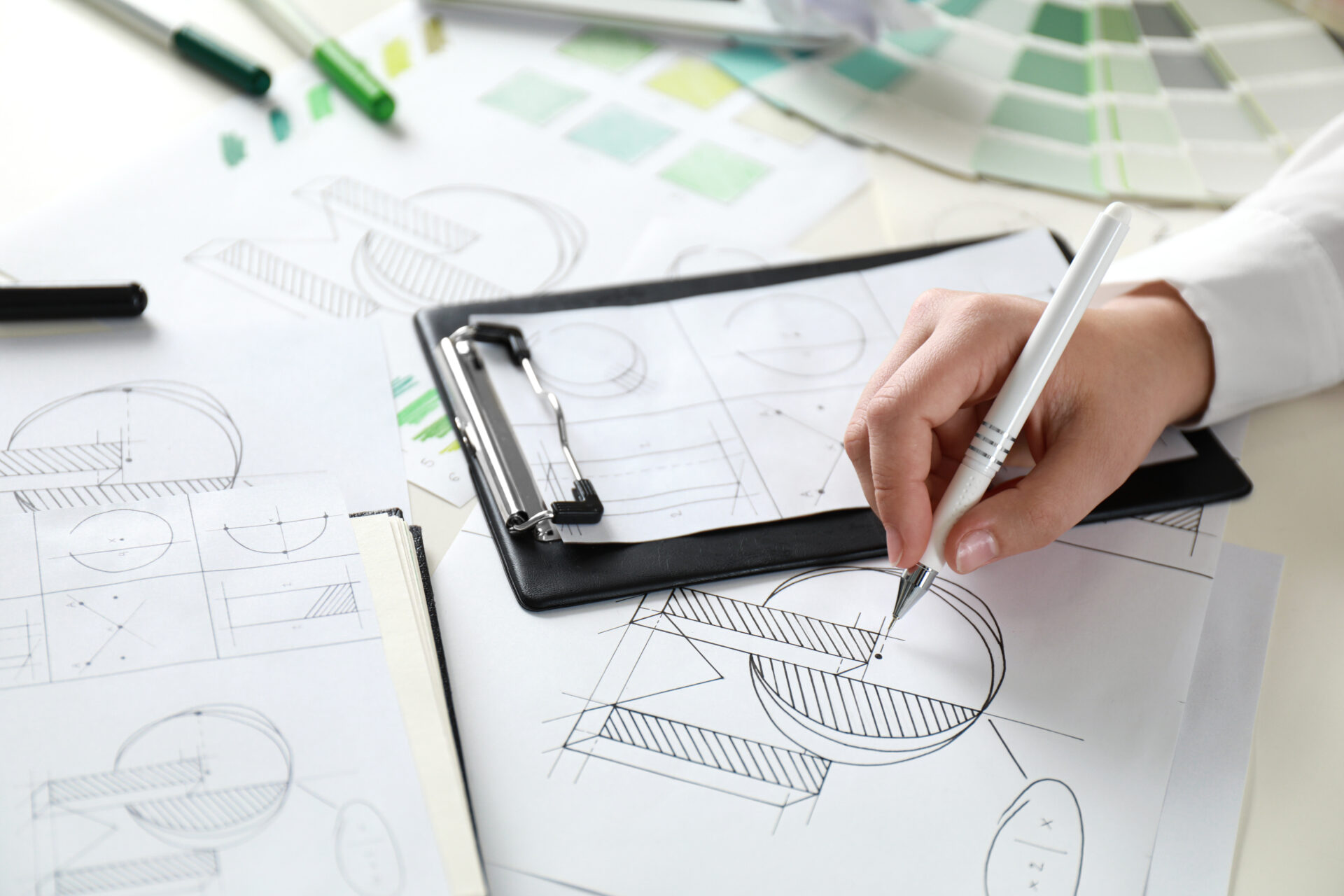
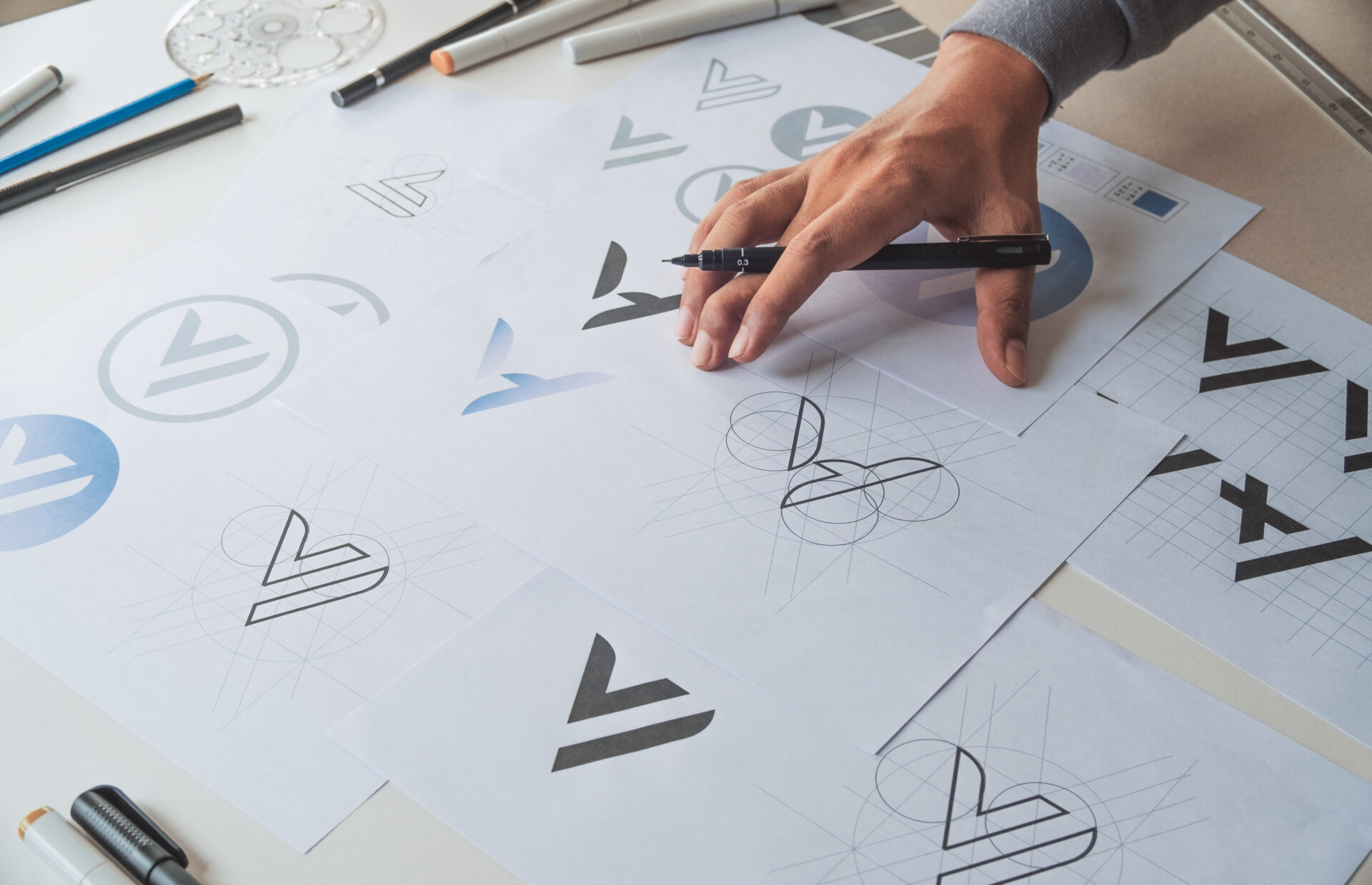
Your designer begins sketching and digitally drafting various concepts. This step can include experimenting with typography, iconography, symbols, and layout variations.
3. Concept Presentation
Once we have crafted a variety of logos that all reflect your goals and could represent your brand, we schedule a presentation so you can see your options.
4. Review, Feedback, and Refinement
You’ll review each concept and provide feedback. Which ones feel most on-brand? What tweaks are needed to get it exactly right? This stage may go through several rounds of revision because we want to ensure that what you receive is 100% in line with your vision and goals.
5. Finalization
Once the final version is approved, we will prepare the logo in various file formats and versions:
- Full color and monochrome
- Horizontal and stacked versions
- Transparent backgrounds
- Web, print, and vector files (e.g., .PNG, .JPG, .SVG, .EPS)
If it’s helpful, we can also craft a brand standards guide that outlines logo usage rules for consistency across all departments within your company.
Design Choices to Consider

When it comes to logo design, it helps to understand the core design choices that go into a logo:
1. Typography
Font choice can instantly set the tone of your brand. For instance, serif fonts feel traditional and trustworthy, while sans-serif fonts feel modern and clean. Handwritten or custom fonts add personality.
2. Color Psychology
Colors evoke emotion. For example:
- Blue = trust, professionalism (common in finance and tech)
- Red = energy, urgency (popular in food and retail)
- Green = health, growth (frequently used in eco and wellness brands)
Be mindful of how other cultures may interpret certain colors if you operate internationally.
3. Symbols and Icons
A logo might include a recognizable symbol (like Twitter’s bird or Target’s bullseye) or be entirely text-based (like Coca-Cola). The decision depends on your brand goals and industry.
4. Wordmarks, Icons, or Combination Marks
- Wordmark: Logo made entirely from your company name (e.g., Google)
- Icon/Symbol: Abstract or literal image without text (e.g., Apple)
- Combination mark: Symbol + text (e.g., Adidas)
Combination marks are a great choice for new businesses because they provide flexibility and name recognition.
Common Logo Mistakes to Avoid
A quality logo can elevate your brand, while a poorly designed one can create confusion or dilute your credibility. Here are some pitfalls to steer clear of:
- Overcomplicating the design: Too many colors, fonts, or visual elements lead to a cluttered and hard-to-recognize logo.
- Copying competitors: You want to stand out, not blend in.
- Using clip art or stock graphics: These won’t be unique to your brand and may raise copyright issues.
- Ignoring usage scenarios: A logo might look great on a website but fall apart on a T-shirt or business card if it is not planned properly.
Why Choose the Marketing Pros for Your Logo?
A quality logo is an investment in your brand, so it’s essential to partner with an agency that has a proven track record for logo creation.
At M&R, we hit all the qualifications you should look for in a partner agency:
- We create designs that are unique and true to you
- We boast a strong logo portfolio with diverse styles
- We receive positive testimonials from satisfied clients
- We rely on a clear, proven process for logo design
While it may be tempting to go this route, avoid cheap logo mills or “$5 logo” websites. They may save money now, but you’ll likely pay more when you realize the need for a rebrand sooner rather than later.
Need Help Crafting a Quality Logo Design? Talk to the Pros at M&R Marketing. 478-621-4491
At M&R Marketing, our creative team specializes in crafting logos that are more than just visually compelling—they are foundationally and strategically aligned with your brand. Whether you’re launching a new business or refreshing an outdated logo, we’re here to produce the logo you’ll be proud to start displaying.
Let’s create something unforgettable—speak with one of our business development managers today!
Detailed Marketing Deets
Want some profound insight into all things marketing? Check out our Definitive Guide Series for detailed information, tips, and advice regarding:

