
Both adaptive and responsive website design are fairly new to the digital world – adaptive website design made its debut in 2011 and responsive website design was introduced in 2010. Although they’ve been around for just a handful of years, their impact on the digital world is monumental. Allow us to explain the differences between the two, benefits and disadvantages, and more.
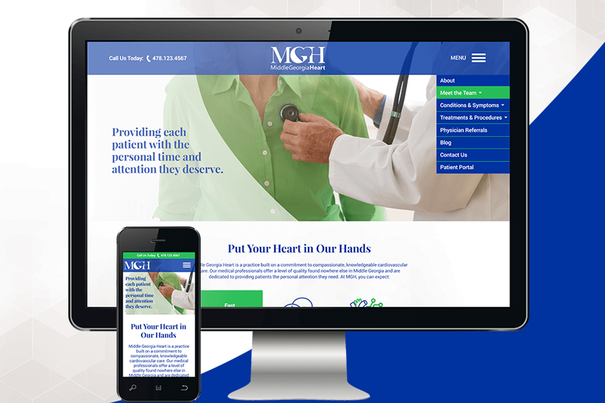
Responsive Website Design
A responsive website design utilizes one layout across multiple devices. The layout will respond to the size of the device – from a large desktop computer to a small iPhone screen. It will reshuffle the elements of the webpage – logos, contents, images, and the like – to fit the available size limit.
Website visitors would rather exit a webpage than have to zoom and pinch to read the content. A responsive website design eliminates this frustration and enhances the user experience. Other benefits of a responsive website design include:
- Easier to Maintain – Because a responsive website design only has one layout, you only need to make one change and it is implemented across all devices. (This is unlike other website designs that require you to make changes across all layouts.)
- Enhance the User Experience – With a responsive website design, you are utilizing the same layout across all devices. You won’t have to build different layouts and do your best to make it identical. Because of this consistency, you are contributing to an enhanced user experience. Consistency will contribute to the website visitor’s sense of security and confidence in your products, services, and company overall.
- Fast Load Times – Does your website load in less than 3 seconds? If it doesn’t, you’re losing customers. We are in an age of instantaneous expectation. Website visitors don’t want to wait for pages to load. Responsive website designs – when built correctly – will load within three seconds or less.
- Flexibility – As new technology continues to debut, it’s imperative that your current website can seamlessly fit to the space available in new devices. Responsive website designs will have an easier time fitting into these new screen size limits than adaptive website designs.
- SEO Optimization – It’s every company’s dream to be on the first page of a search engine like Google. A responsive website design drastically increases the likelihood of this, as Google ranks responsive website designs higher than adaptive. (Higher ranking = higher likelihood of website visitors).
The benefits of a responsive website design can ultimately improve the customer experience, increase profit, and secure your position as a threat to your competition. Take a look at several responsive website designs we’ve created, then contact one of our awesome account managers with your questions.
Adaptive Website Design
An adaptive website design requires multiple layouts to be made in order to best accommodate different screen sizes. When a user visits a website on a desktop computer, there will be back-end communication to prompt the right layout to load. The same is true for a tablet, cellphone, and other devices with different size limits. Normally, up to six layouts are made to adapt to common screen widths – 320, 480, 760, 960, 1200, and 1600 pixels.
There are several reasons why our talented web developers choose responsive website design over adaptive. With adaptive website designs, you must:
- Build multiple layouts
- Make changes on all layouts instead of just one
- Conduct more maintenance on each layout (versus responsive)
Adaptive website designs aren’t great for companies that want to show up on the first page of search engine results. We encourage you to choose a responsive website design to better reach your customers and provide them with a seamless experience.
Partner with M&R Marketing for Your Website Design Needs
Your website is the online representation of your company. Without a stunning and responsive website design, a visitor will search elsewhere for a solution to their problem. The M&R web developers have immense experience building responsive website designs that benefit our client. Whether you don’t have a website at all or you need a complete rehaul on your current website, we’d love to partner with you. Give us a call with your questions: 478-621-4491.
If you missed parts one, two, or three in our blog series about the non-negotiables of your website design, you can check them out here:
- Part 1 – 6 Elements You Must Have in Your Website Design
- Part 2 – Avoid These 6 Website Design Mistakes
- Part 3 – How Web Design Affects Search Engine Rankings
- Part 4 – Understanding the 2 Types of Website Design